

(Like some cardboard with your #FridayFeeling? Read the whole series of related posts here.)
Driving through town this morning, I caught sight of an older gentleman waiting to cross the street, and something about him struck me.
It was his ears.
And his nose.
The former jutted from the sides of his head and climbed over the sides of his John Deere baseball cap.
The latter was the most prominent feature of a weathered face that probably looked older than it was.
And all I could think of as he faded from view was, “I wonder what Don Mossi is up to these days.”
After a bit of digging, I found that Mossi is still kicking and is, in fact, the last surviving member of the 1954 Cleveland Indians pitching staff.
I also came across this 2012 piece from Jim Caple calling out what he termed, “The Weird, The Bad and The Ugly.” Among those pasteboards, Caple included the 1966 Topps Don Mossi. And while the ESPN piece didn’t specify a category for Mossi — Weird, Bad, or Ugly — we can make some inferences from the text.
Anyway, that got me thinking about the subjective way we judge baseball cards (and everything else) and made me ponder just what other collectors — or at least cardholders — consider to be weird or bad or ugly.
Leaving weird and bad on the cutting room floor for now, I decided to focus on Ugly. And for my source, I went right to a real live market — eBay — and consulted the sellers themselves.
Because, if you’re trying to sell me something, and you yourself say it’s ugly, then there is a pretty good chance that it’s not gorgeous.
So here are the specimens I uncovered when I typed “ugly baseball cards” into the wondrous eBay machine on the morning of October 27, 2017.

Pete Rose “Pesque Hueso” Beer Game Card Test Issue
I had never seen these cards before, but this baby jumped out at me from the listings for three reasons:
- I’m a longtime Pete Rose collector, and it was clear that this drawing was meant to represent Charlie Hustle.
- The design looks an awful lot like 1974 Topps cards and especially calls to mind the San Diego Padres/Washington Nat’l. cards.
- It’s really ugly.
I mean, Pete may not be the best looking guy to ever pull on the spikes, but this is rough even for him.
Even so … it’s something “new” to me, and it’s darn interesting for less than 10 bucks.

1910-11 Sporting Life M116 Clyde Milan
Sometimes, beauty is conditional. On the surface, there is nothing really ugly or unappealing about the M116 set or the Clyde Milan card in particular.
Sure, it’s not quite up to the standard of the dazzling colors of the T206 set, and there is no Honus Wagner card to drive it along, but this issue is pretty solid.
In the case of this particular Milan card, though, the ugliness is all about, well, the surface. In particular, there is a large water stain over the top half or so of the card that makes ol’ Clyde look like he’s drifting off into the clouds.
As the seller notes, this is a good, solid “ugly filler” card if you’re looking to make some hay on your M116 quest.

I first came across these gems in a shoebox full of rough 1974 Topps cards I bought at an antique shop in the early nineties. I honestly thought at the time that they were little sheets of paper that some collector had scribbled on. Only after a bit of research did I realize that those weren’t scribbles — they were facsimile autographs of the players on each team’s roster.
This is a pretty cool concept in theory, and the cards have enjoyed a modicum of popularity in the hobby over the last 20 years or so.
But there is no denying that these puppies are homely, and the 1973 versions might be even worse.
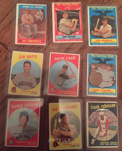
The 1959 Topps set was an issue caught in between two decades, eschewing the paintings that dominated most pastebaords of the 50s but not quite ready to let go of the solid colored backgrounds of its predecessors. The result was a porthole design that was fine but left player photos a bit small for my taste.
But are they ugly?
Not especially, though some of the special cards are a bit garish. Maybe the seller here takes exception to the blue-and-red scheme on the Roy Campanella tribute card or the busy design of the All-Star cards.
Hard to say, but perhaps the 1959s deserve another look just to see if we can spot the ugly?

In general, the 1965 set is a classic issue that any collector, any fan, would be proud and happy to slide into sheets or paste on the walls of his man cave.
But, given the featured image accompanying this listing, we can make some observations, a few with “ugly” implications:
- Dean Chance was really good, even if he looked a bit vampirish.
- Johnny Romano wore an expression that at least verged on ugly.
- I’m changing my name to Bill McCool.
- Don’t mess with Gates Brown.
- Don Blasingame ate something ugly that didn’t agree with him.
- Charlie Smith just woke up.
- Bob Tiefenauer is checking the oven to make sure the holiday biscuits haven’t caught fire.
- The Minnesota Twins are all kinds of yellow ugly.
I guess there really is ugly hiding just around every corner if you look hard enough.

OK, this is not ugly.
Growing up, the 1976 set was not my favorite, but I’ve really grown to appreciate it over the last couple of years. There are a lot of subtle details — like the player figurine on each card front that roughly matches the pictured player’s position — that make this issue a winner.
And several individual cards are among my favorites ever, including those of Mike Schmidt, Johnny Bench, and Dave Parker.
So why does this listing come up in a search for “ugly baseball cards”?
Maybe eBay doesn’t like George Brett‘s gap-toothed deadpan.
Or maybe Pete Rose’s scowl is just a bit too much Willem Dafoe.
Who knows?
Ugly or not, though, it’s a winner.

This one has a few things working against it …
First, the cards are from the 1968 Topps issue. Burlap borders and missing team logos are hard to love even after all these years.
Then there are the listing photos, which feature the cards against a beautiful hardwood surface and awash in golden light that *might* actually be sunlight. Nice.
Well, except for the overall effect, which makes everything about the cards look like they got hold of some bad spray-on tan.
And finally, there is the beat-up card of Jim Lemon peeping through its brethren in the third photo. At first, I actually thought the card was a 1969, and a bit of research shows that the two issues do use the same photo.
But this Lemon card is from 1968, and when you combine the iffy card design with big, worn creases and corners softer than a bunny’s belly fur, you might consider it ugly.
The more I look at it, though, the more I think Lemon might be the best of the bunch. Certainly appears to have been the most loved.

If you had never seen a 1975 Topps baseball card, then you might be forgiven for thinking that this lot is, indeed, ugly.
But anyone who’s spent even a few minutes with these classics knows that what at first seems to be a big ol’ pot of visual dissonance is actually a master stroke of color combinations that perfectly captures the era in which the cards were issued and renders them instantly recognizable. Chills, I tell you!
That said, there is some funky airbrushing going on with that “1975 Rookie Outfielders” card, don’t you think? Nyls Nyman deserved better if for no other reason than his amazing name.
—
So what do you think?
Are these baseball cards ugly or not?
And what do you consider to be the ugliest baseball card around? Let me know in the comments below.

1981 Topps Baseball Cards Complete Your Set U-Pick (#'s 201-400) Nm-Mint
 | $1.29 Buy it now | Add to watch list |
Lot Of 50 1981 Topps Baseball Cards - No Duplicates - Free Shipping
 | $20.00 Buy it now | Add to watch list |
1981 Topps Baseball Cards Set of 17 Uncut-Squirt Exclusive Limited Edition
 | $50.00 Buy it now | Add to watch list |
1981 Topps baseball Cards starter set of 141 all different. Pete LaCock
 | $6.75 Buy it now | Add to watch list |
1981 Topps Baseball Cards Complete Your Set U-Pick (#'s 1-200) Nm-Mint
 | $0.99 Buy it now | Add to watch list |
1981 Topps Baseball Cards Complete Your Set U-Pick (#'s 401-600) Nm-Mint
 | $1.09 Buy it now | Add to watch list |
1981 Topps Baseball Cards Complete Your Set U-Pick (#'s 601-726) Nm-Mint
 | $0.99 Buy it now | Add to watch list |
1981 Topps Baseball Cards #'s 1-250 NMMT You Pick + Free Shipping!
 | $1.00 Buy it now | Add to watch list |


Recent Comments