

(Check out our other team pages here.)
In 1956, just after they had dispatched rival Bowman to the commons bin of history, Topps began experimenting with their baseball card sets.
And why not?
When you’re the king, the only game in town, you have little to lose by flexing your artistic muscles.
One of the innovations they unveiled in that first spring of the monopoly years was the team card, wherein all players for a particular club were gathered together for a group photo that adorned one of Topps’ cards for the year.
The team card would become a hobby staple over the next 25 years, and maybe no franchise enjoyed a strong association with the concept in collectors’ minds than the Chicago Cubs.
Although the Cubs didn’t win many games over the next quarter century, they were always game to help Topps spice up — and weird out — their team card subsets.
Here is how the Cubs turned, together, during that long stretch of cardboard history.
1956 Topps Chicago Cubs Team Cards

Check prices on eBay (affiliate link)
Check prices on Amazon (affiliate link)
The visual links between this card and the rest of the 1956 Topps set are subtle — the horizontal layout, the black bar that’s reminiscent of the player name and team name bars on base player cards, the thick all-caps block font. Otherwise, you’d be hardpressed to tie the two together based on solely card fronts.
It’s fun to see the Cubs logo on the team card here, though, especially since it was missing from player cards that year. And the player and coach roster list at the bottom is a useful, though space-eating tool that was repeated only one other time on Topps team cards.

Check prices on eBay (affiliate link)
Check prices on Amazon (affiliate link)
1957 Topps Chicago Cubs Team Cards

Check prices on eBay (affiliate link)
Check prices on Amazon (affiliate link)
The 1957 Topps set features a clean design with gorgeous full-color photos that has made it one of the classic issues of all time. Topps continued their focus on the “picture” with their team cards by encasing each club within a picture frame and bolting on a “nameplate” to let us know who we’re looking at.
They even included a thick white border to eat up the real estate they freed up by dropping the roster listing.
Bonus!

Check prices on eBay (affiliate link)
Check prices on Amazon (affiliate link)
1958 Topps Chicago Cubs Team Cards

Check prices on eBay (affiliate link)
Check prices on Amazon (affiliate link)
This is another design that bears little resemblance to the base player cards of the year. While Glenn Hobbie and his teammates appear in profile against a solid colored background on their individual cards, they all gathered in Wrigley Field to get — drawn? painted? There’s definitely some sort of artwork going on with the team sot
The baseball in the lower lefthand corner is very 1950s, and the key/roster makes a brief return to the card front. Enjoy it while you can!

Check prices on eBay (affiliate link)
Check prices on Amazon (affiliate link)
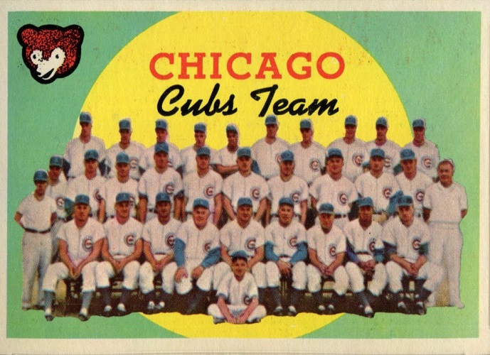
1959 Topps Chicago Cubs Team Cards
Check prices on eBay (affiliate link)
Check prices on Amazon (affiliate link)
Now, this card looks and feels exactly like what it is — part of the 1959 Topps issue. The pale green background, script team name, roundish cartoon Cub, and rendered players all scream 1950s kitsch.
And the big yellow moon in the background adds some much-needed romance to a team who went 72-82 in 1958 and would finish 74-80 in 1959.
1960 Topps Chicago Cubs Team Cards

Check prices on eBay (affiliate link)
Check prices on Amazon (affiliate link)
If you saw this card sitting on a shelf somewhere, what year would you think it was made? 1956? 1960? 1964? And who made it — Topps? Fleer? Leaf? Bowman?
Any of those would be good guesses, because there are almost no visual clues to let you know this gaudy swatch of cardboard hails from the 1960 Topps set, aside from maybe its landscape layout.
But then, aren’t most team card stretched out horizontally?
Regardless, the 1960 Topps Cubs team card does a good job of capturing the feel of the era, from the diamond-shaped “CUBS” designation at the bottom to the red and yellow shapes that would have looked right at home on the floor of any chic 1950s kitchen floor, to the painted(ish) players.
All around, it’s an ugly but beautiful monstrosity of a card.

Check prices on eBay (affiliate link)
Check prices on Amazon (affiliate link)
1961 Topps Chicago Cubs Team Cards

Check prices on eBay (affiliate link)
Check prices on Amazon (affiliate link)
Aside from the stark yellow background, this card looks like it belongs to the 1961 Topps set — which it does.
Borrowing the two-box format of the player cards, Topps just turned their base design sideways, added a team logo, and slapped on a cutout of the team photo.
Lots of color and that adorable Cubbie make this card stand out, though the team itself could stand about a 50% zoom so you wouldn’t need a magnifying glass to see the (blurry) faces.
1962 Topps Chicago Cubs Team Cards

Check prices on eBay (affiliate link)
Check prices on Amazon (affiliate link)
In 1962, Topps continued their newfound tradition of matching the design of their team cards to that of their player cards, which in this case meant those iconic/hated/misunderstood wooden borders.
Also returning were tiny player images set amid a desert of solid color — red for 1962 — and the typical landscape layout.
In fact, also also returning was the same exact Cubs team image as Topps used in 1961. Cut down on someone’s expenses, I suppose.
Gone, sadly was the Cubs logo, replaced by a black oval with “CHICAGO CUBS” in white block letters.
1963 Topps Chicago Cubs Team Cards

Check prices on eBay (affiliate link)
Check prices on Amazon (affiliate link)
For 1963, Topps pretty much just turned their player design on its side, added a team logo where the headshot would have been, lathered on a solid background, and called it a team card. The effect is striking and artistic, especially since they blew up the team photo to fill more of the card than had been the case in previous years.
And, in the case of the Chicago Cubs, the headshot remained, thanks to a return of the team mascot.
Yay!
1964 Topps Chicago Cubs Team Cards

Check prices on eBay (affiliate link)
Check prices on Amazon (affiliate link)
Topps continued their trend of using the same basic design for their team cards as graced player cards in 1964. That led to big, bold cards like this one of the Chicago Cubs, where the team takes up more real estate than ever before. The red background may be a bit jarring, but it’s distinctive and complements the Cubbies’ cap “C” well.
You know, the same exact “C”s on the same exact players in the same exact poses as in 1963.
Yes, Topps was a great recycler back in those days.
1965 Topps Chicago Cubs Team Cards

Check prices on eBay (affiliate link)
Check prices on Amazon (affiliate link)
Once again in 1965, Topps copied their base-card design when putting together their team cards, and the translation worked beautifully. How anyone can look at a 1965 Topps card — particularly one like this with the Cubbie head — with its pennants and bold colors and not get all rah-rah about heading out to a ballgame post-haste is beyond me.
Well, there is the little issue of this being the third year in a row that Topps used an identical Cubs team picture. I meant, beyond that.
The only other downside to this card for Cubs fans is a boon for collectors in general — listing each team’s finish in 1964 was an innovation that was, at the least, a flavorful convenience.
And, in some cases, no doubt an embarrassment.
1966 Topps Chicago Cubs Team Card

Check prices on eBay (affiliate link)
Check prices on Amazon (affiliate link)
This card is pure 1966 Topps, again copying directly from the base player design. The team’s finish from the year before makes a return appearance and is no more encouraging for Cubs fans than it was on the 1965 card.
Sadly, the Cub himself is missing, and the orange and green color scheme is an odd choice for Chicago. Maybe it’s a reflection of the fans’ complexion after watching the team on the field all season long?
1967 Topps Chicago Cubs Team Cards

Check prices on eBay (affiliate link)
Check prices on Amazon (affiliate link)
Simplicity was the name of the game for the 1967 Topps set, and that theme carried over to the team cards. That mad the four-letter C-U-B-S just about the starkest major card ever issued, especially with the shrunken size of the team photo itself.
Mercifully, Topps left team finishes off their 1967 cards, as the Cubs had fared even worse in 1966 — losing 103 games and finishing 10th out of 10 NL teams — than they had the previous two years.
1968 Topps Chicago Cubs Team Cards
The Cubs took a quantum leap forward in 1967, winning 87 games and finishing in third place in the National League. Alas, it was not enough to impress Topps, as the Old Gum Company omitted Chicago from its team-card lineup.
The Cubs were not alone in that, however. Even though Topps did issue team cards in 1968, a total of seven teams were skipped — Boston Red Sox, Chicago Cubs, Cleveland Indians, Houston Astros, New York Yankees, San Francisco Giants, and Washington Senators.
1969 Topps Chicago Cubs Team Cards

Check prices on eBay (affiliate link)
Check prices on Amazon (affiliate link)
For the first time since 1955, Topps left team cards off their base set roster in 1969. However, they presented a nifty alternative in the form of Topps Team Posters, which were sold individually in their own packs for 10 cents each.
Even though they were folded and creased, the 12″-by-20″ posters made (and make) great display pieces. Featuring 10 of the biggest names from each club, the posters are colorful and give you a good shot of late 1960s/early 1970s style.
Significantly, these posters gave the first hint of the bubble heads to come.
1970 Topps Chicago Cubs Team Cards

Check prices on eBay (affiliate link)
Check prices on Amazon (affiliate link)
Topps brought team cards back in 1970 and rendered them with the same gray borders lavished on player cards. Gone were the solid backgrounds of the team cards from the 1960s, replace with “real” surroundings, which in the case of the Cubs was apparently the inside of a canvas sack.
1971 Topps Chicago Cubs Team Cards

Check prices on eBay (affiliate link)
Check prices on Amazon (affiliate link)
By the early 1970s, things were funky everywhere.
That went double for baseball cards.
Topps had already begun fiddling with their borders, opting for the aforementioned gray in 1970.
Then, in 1971, they fired the artistic shot that still reverberates nearly 50 years later — black borders!
Topps also kept up their tradition of issuing team cards that closely matched the style of their player cards, turning them to landscape and replacing the player info with the team name in big, colorful block letters.

Check prices on eBay (affiliate link)
Check prices on Amazon (affiliate link)
But the Cubs were also getting funky on the Northside in 1971, at least on their Topps team card.
Instead of the “boring” design afforded to other clubs, the Cubs card is presented in a vertical format with just the heads and necks — “floating heads” — of players and coaches scattered around a green diamond. Each is garnished with a facsimile signature under the disembodied head. The Cubs logo sits dead center, atop the pitcher’s mound.
All of that is surrounded by the typical small white piping and thick black border of the 1971s, but there is no text at all outside of the field of play.
So the question is …
Why is the Cubs card so different from other teams’ pasteboards?
I can only assume that Topps either didn’t want to or couldn’t convince the Cubs to gather as a team for a photo. Maybe it had something to do with that collapse in 1969.
1972 Topps Chicago Cubs Team Cards

Check prices on eBay (affiliate link)
Check prices on Amazon (affiliate link)
So in 1972, Topps fully embraced 1970s funk with a psychedelic starburst design that still hurts various brain lobes when glimpsed today.
It’s awesome.
And once again, the Cubs made an already wild set all the funkier by showing up as head bubbles, this time without any necks at all and without the courtesy of a diamond behind them.
If there were ever a haunted baseball card, this just might be the one, what with its ghostly sheet of a background and orbed-up headshots.
At least we still get to see Banks and Fergie Jenkins and Billy Williams and Ron Santo.
1973 Topps Chicago Cubs Team Cards

Check prices on eBay (affiliate link)
Check prices on Amazon (affiliate link)
The 1973 Topps team cards just may be the plainest subset ever issued by a major card maker. They feature the same basic typeface and black piping inside a thick white border as the player cards, sure, but all traces of personality are gone.
Whereas you get a little text and a cool player icon with, say, Jose Cardenal …

Check prices on eBay (affiliate link)
Check prices on Amazon (affiliate link)
… with the teams, you get just the piping, the team name, the photo … and that’s all. At least the Cubs were able to sneak some ivy into their club shot.
Although … the photo quality is poor enough that the Cubs logo looks sorta like a bullseye or … a rose? …. on their chests.
1974 Topps Chicago Cubs Team Cards

Check prices on eBay (affiliate link)
Check prices on Amazon (affiliate link)
After a one-year reprieve to enjoy the ivy, the Cubs were back in floating-head mode on their 1974 Topps team card.
And this time, the whole thing was more thrown-together than ever.
Instead of a quasi-artistic arrangement like in 1971 and 1972, the 1974 rendition of the Cubbies has a bunch of heads ironed on to a crappy piece of paper that someone then pasted to a corkboard.
“You want a Cubs team card? You want a Cubs team card?? Well, here’s your stinkin’ Cubs team card!!!“
On the plus side, the Cubs are starting to break out the cheese that would come to dominate their cardboard toward the end of the decade.
Check out those beasts perched above the lips of Carmen Fanzone (what a sports name!) and Bob Locker (what a sports name!). Even Billy Williams got in on the act.
1975 Topps Chicago Cubs Team Cards

Check prices on eBay (affiliate link)
Check prices on Amazon (affiliate link)
The Cubs pulled themselves back into Topps’ good graces in 1975, scoring a “normal” team card for just the second time since 1970.
The dark ivy background both makes up for and accentuates the ethereal glow splashed across players’ faces, but at least manager Jim Marshall is happy with his closeup
1976 Topps Chicago Cubs Team Cards

Check prices on eBay (affiliate link)
Check prices on Amazon (affiliate link)
Marshall still looks pretty engaged on the Cubs 1976 Topps card, but the floating heads are back.
As in 1972, we get a ghostly white background and no-neck cabezas, but at least there is some fun facial hair to ponder.
I mean, without this card, how would we have known that old dudes liked to wear white sideburns sans a beard in the middle 1970s?
1977 Topps Chicago Cubs Team Cards

Check prices on eBay (affiliate link)
Check prices on Amazon (affiliate link)
The 1977 Topps Cubs team card brought more disembodied noggins, but with a twist: instead of just plopping the heads on a white background, Topps enclosed each head in bluish-white circle and then plopped that whole thing on a slightly less white, more brown background.
Refreshing.
And, Paul Reuschel‘s black-rim spectacles are featured prominently.
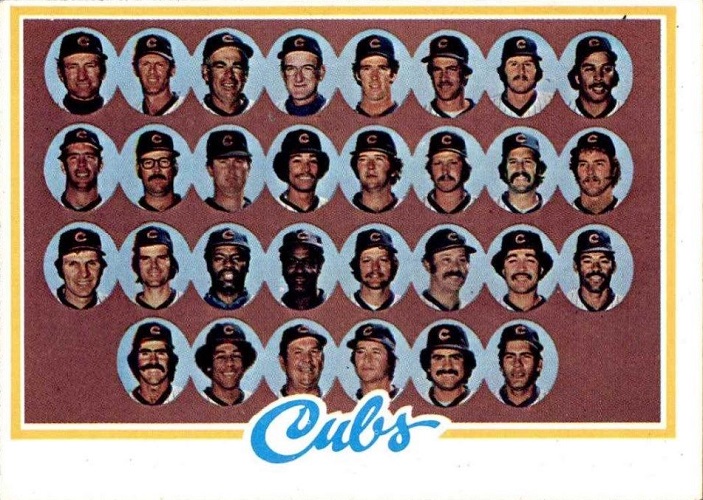
1978 Topps Chicago Cubs Team Cards
Check prices on eBay (affiliate link)
Check prices on Amazon (affiliate link)
The 1978 Topps Cubs team card is notable for several monumental developments:
- The return of necks.
- The expansion of the inner bubble to include the necks.
- A hint of shoulders.
- A bluer inner bubble.
- A maroon background on which the blue bubbles rest.
- The Cubs debut of a wonderfully hirsute Bill Buckner.
It’s terrible.
It’s glorious.
1979 Topps Chicago Cubs Team Cards

Check prices on eBay (affiliate link)
Check prices on Amazon (affiliate link)
Ho hum.
Another year, another floating heads permutation for Topps and their Chicago Cubs team card.
This one conforms pretty well to the base player design, with a simple black piping around the photo leading to a chevron-indented banner at the bottom of the card.
On team cards, this ribbon features a headshot of the manager — Herman Franks for the Cubs.
To be fair, these aren’t your typical head bubbles, as Cubs players got to keep not just their necks but also an even bigger part of their shoulders than the year before. Such progress!
The green background gives the card a very baseball-y feel, and the cheesy mustache ratio is outstanding!
Heck, there is even a doofy looking Davey Johnson thrown in there somewhere, which almost makes up for a glassesless Reuschel (Rick only in this case, Paul was gone to Cleveland).
1980 Topps Chicago Cubs Team Cards

Check prices on eBay (affiliate link)
Check prices on Amazon (affiliate link)
Everything I said about the 1979 Topps Cubs team card applies to the 1980 Topps team card except the basic card design — this one has the 1980 banner, not the 1979 banner.
Oh, and except for there is no Davey Johnson.
There is still Rick Reuschel with no glasses, though, making us miss Paul again. In fact … it’s the exact same glassesless shot as in 1979
And another in fact, all of the repeat players have the same pic as in 1979 — Dave Kingman, Larry Biittner (reeaallyy), a clean-shaven Bruce Sutter, Manny Trillo, Mick Kelleher — all of ’em.
You get the feeling Topps had just about given up the ghost on team cards by this point?
1981 Topps Chicago Cubs Team Cards

Check prices on eBay (affiliate link)
Check prices on Amazon (affiliate link)
Well, yeah, Topps had just about given up the ghost.
But they hung around long enough to give the Cubs one last floating heads-and-partial-shoulders against creamy background team card in 1981.
There were plenty of holdover photos from the previous two years, but out of 29 players and coaches pictured, a whopping 51 of them have big, cheesy mustaches, which makes it all OK.
One can only wonder …
Did the Topps team cards cause the mustaches to appear, or did the mustaches make Topps team cards self-destruct?
If it was the former, can you imagine what Ryne Sandberg might have looked like had Topps limped their team cards along into the middle 1980s?
Oh, the horror!
Oh … the missed glory!
(Check out our other team pages here.)
Want to see a video version of this article?

Chicago Cubs Baseball Cards Choose From 100s Players Qty Discount Part 31

$1.69
Buy it now | Add to watch list Lot Of 50 Chicago Cubs Baseball Cards - No Duplicates - Free Shipping

$20.00
Buy it now | Add to watch list Lot Of 50 Chicago Cubs Baseball Cards - No Duplicates - Free Shipping
$20.00
Buy it now | Add to watch list


Unless I am mistaken, Topps used two team photos twice in the early/mid sixties. I’d sure like to know what they were thinking all of those years. Fun piece.
You’re right! Same Cubs photo in 1961 & 1962, and then a different photo for 1963 that they also used in 1964 & 1965. “We’ll change the background, and no one will notice.”
1961 and 1962 have the exact same team photo!
OOPS, SOMEONE BEAT ME TO IT.
There’s always room for insight, even if it’s a repeat!
Very interesting stuff. FYI, in the ’77 and ’78 photos, the black-rimmed glasses belong to Rick’s brother, Paul Reuschel.
The reason Topps used the Floaty-Head design is that is what was sold at souvenir stands at Wrigley. I would get one every year.
Were they the same pictures? I definitely would be interested to know if there are sources directly linking Topps and the Wrigley souvenirs.