(This is Day 11 of our series on the “Best Card From” each year, 1960-1989. Read all the entries here.)
The 1970s Topps set is like chili or stew — it usually “tastes” best when served as a leftover.
At first, all you see is a boring design with boring fonts and drab gray borders.
It looks like something your local (amateur) card counterfeiter might put together in his garage on a Saturday afternoon because there is just no flair. Even the team name on each card front looks like an afterthought that was added on with a big, block-letter-printing typewriter.
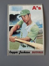
Even a superstar and hot dog deluxe like Reggie Jackson seems subdued checking a mock swing while looking away from the camera.
Check prices on eBay (affiliate link)
Check prices on Amazon (affiliate link)
Oooo, the Colors!
Things start to get a little better when you flip the cards over, though. The bright yellow and blue motif against a white background makes the card backs easy to read, and the unusual color combination imparts a slight comic-book feel.
Of course, the large comic in the upper right-hand corner of the horizontal backs also helps out in that regard.
In Reggie Jackson’s case, we’re treated to a hand-drawn “TEN” atop a hand-drawn “RBI” that looks like something out of the “B.C.” comic strip or maybe a screenshot from Schoolhouse Rock.
In the lower corner of the word sculpture is a cartoon batter smacking a ball into the stratosphere. Above the drawing, we learn that:
Reggie had 10 RBI’s in one game, 6-14-69.
The adjacent blue field tells us that Reggie went from college star to Major League superstar in the course of just a couple years and teases us with a few stats.
Below that, in the stats block, we see the full story of his monster sophomore season: 47 home runs, 118 RBI, .275 average.
Check prices on eBay (affiliate link)
Check prices on Amazon (affiliate link)
Worth a Second Look
Happified by this blue-and-yellow Reggie bliss, you might feel a bit better about the dank 1970 set. You might even be enticed to take a second look at the front of Reggie’s card.
When you do, you could notice a few details you missed the first time around:
- The white piping between the photo and the border, and between the player name and his position, helps spice up the design.
- The black script player name and red block position text actually work really well together.
- If you look at enough of the cards, or stare at one card long enough, you’ll start to pick up on some subtle brown undertones at least suggested by the gray borders.
- The old Yankee Stadium grandstand looming in the background of Reggie’s card is like a gateway to baseball’s storied past.
- Reggie’s eyes aren’t so much bored as they are questioning and disbelieving — as if someone has told him he’s not the greatest player in the game.
- That old A’s road uniform looks really good — as always.
- Reggie’s cap actually says “A” instead of “A’s.” You can insert your own punchline, but it would be the end of the line for the singular denotation.
- Reggie is NOT checking his swing — he’s just winding up like a toy dynamo preparing to unleash real power on the world.
- Reggie has no facial hair. Apparently, he was still perfecting his hot-dog routine at this point, and the ‘stache would be his own personal mustard as the crazy 1970s rolled on.
Yeah, this set is not so bad after all.
And neither is Reggie Jackson’s second-year card.
For most of my collecting life, the 1971 Topps Reggie Jackson has been one of my favorite cards, and I came into this series thinking it would carry the flag for 1971. But I have other plans for that year now.
And, in the end, the 1970 Topps Reggie card is probably better, anyway.
It’s also the best card issued in 1970.
(Read all about this 30-day challenge — and jump in on the fun — right here.)
Want to see a video version of this article?

1970 Topps #140 Reggie Jackson Oakland Athletics HOF VG-VGEX (Mark on Face)

$14.40
Buy it now | Add to watch list 1970 Topps Set-Break #140 Reggie Jackson NR-MINT *GMCARDS*

$17.50 (9 Bids)
End Date: Tuesday 04/28/2026 20:04:16 EDT
Bid now | Add to watch list


The 70 set is actually my favorite, but not because of design. That was the year I started collecting baseball cards.
That’s a good reason, for sure!